Engineering “over-supply” 1990-2002
From the original research by Paul Martin, P. Eng.,
we start from:-
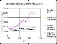
Based on this, he produced a graphic for what he called
“engineering over-supply” (meaning numbers of people available minus jobs
available, each year).
The pink curve represented the actual numbers of new
engineers entering the job market each year.
The pale blue curve represented the actual numbers of
job openings for engineers becoming available each year. Some of these would
have been new jobs while the others would be those arising from retirements and
attrition for other reasons. Analysis of
the original figures (from Mr. Martin’s original MS Excel spreadsheet)
indicates this curve to have a slope of about + 65 new jobs per year.
So as to not appear to “exaggerate” the size of the
actual problem, he further assumed that:-
(1) In 1990, all the engineers available (pink curve)
got jobs - so for that year, the value of the “relative Canadian job growth”
(pale blue curve) equalled the pink curve.
(2) After 1990, the slope of the pale blue curve was
130 new jobs per year (as opposed to 65).
(You could re-state this by saying “double the slope
of the pale blue curve and shift it upwards to match the pink curve for 1990”.)
The result of subtracting the values for this “corrected” pale blue curve from the values for the pink curve, and plotting the cumulatives for 1991 onwards, is an optimistic “cumulative over-supply of engineers 1990-2002” curve as follows:-
Cumulative over-supply of engineers
1990-2002
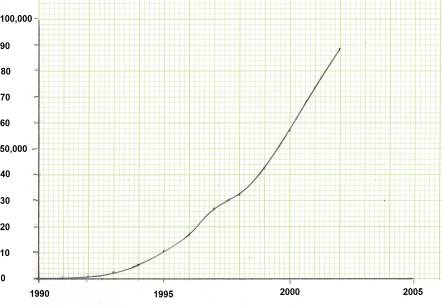
- from which we conclude that the cumulative over supply of engineers between 1990 and 2002 was about 88,600. If you repeat the exercise based on the actual trend in the “relative real GDP growth” (the slope is about 143 new jobs per year, instead of 130) , the result is about 87,600.